PROJECT OVERVIEW
What is the problem?
Most of the popular recipe apps available today are bloated. A bloated app often overwhelms users with too many features, buttons, and options, leading to confusion and frustration. Users may struggle to navigate through the cluttered interface to find what they need.
Too many features can make the app overly complex, intimidating users and discouraging them from using it altogether. Users may prefer simpler alternatives that focus on core functionality.
To solve this problem I decided to design a recipe app which streamlines its features and focuses mainly on the core functionality of quickly finding recipes; Prioritizing the users needs and preferences through user research and feedback.
It will be designed with simplicity and intuitiveness in mind, ensuring easy navigation and a pleasant user experience.
The solution?
Munch’in is a recipe app that provides food lovers with a simple user interface which allows for the finding recipes in the blink of an eye. Munch’in prioritizes finding and saving of recipes with no extra bloat, while also allowing recipe feedback.
What is Munch’in ?
Research, Visual Design, Wireframing, Prototyping
My roles in this project
Softwares used


PROJECT TIMELINE
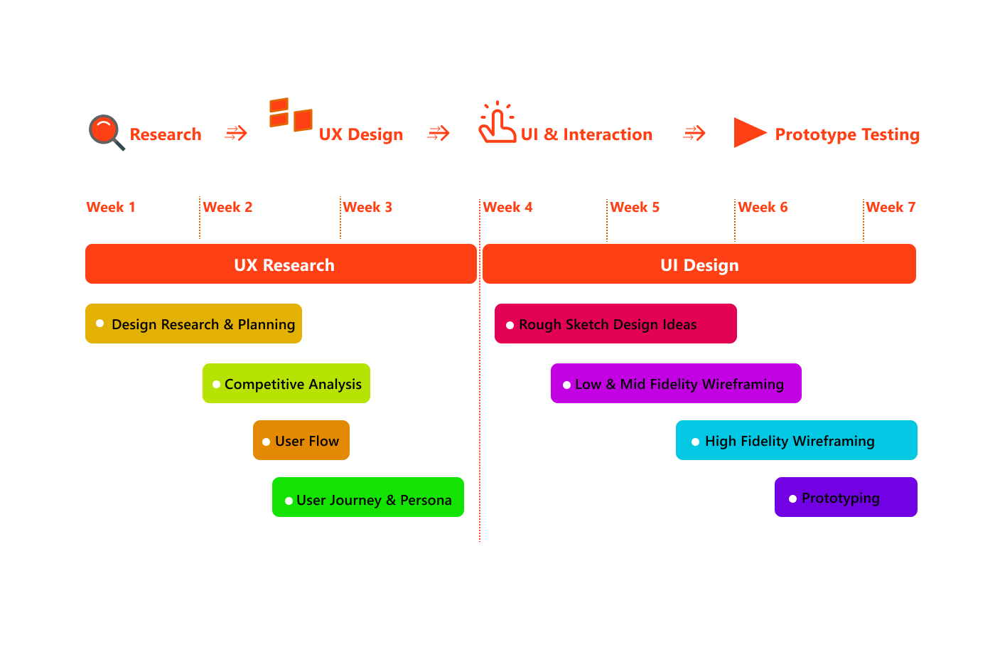
RESEARCH PROCESS
This recipe app initiative began with thorough research, including Qualitative research and Competitive analysis focused on easy navigation and finding realistic recipes fast which can be made at home. Following this, conversations were made which provided invaluable insights into these areas. The objective was to craft an app that assists user to find recipes easily which they can quickly follow to create meals swiftly.
I interviewed seven(7) individuals for this Qualitative research. These persons were a combination of friends and aquaintances. This was in order to understand how cooking food, buying food and searching for recipes play apart in their daily lives. These interviews were conducted live, through whatsapp calls and facetime calls. The questions are listed below.
How often do you cook during the week?
Do you search for recipes often?
How often do you order or go out to eat?
Does your work interfere with how often you get to cook?
Do you cook the same types of foods often?
Would you like to be able to experience new and unique foods more often?
Do you find it hard to find new recipes?
How often do you cook for others?
Knowledge I gained from these interviews
Due to intensive work weeks and school life, finding time for trying new recipes can be difficult.
Cooking from home and ordering are both on equal footing but eating out is not done frequently as the free time is not available.
It can be difficult to find new recipes as taking the time out to search the internet is not very convenient for some people.
The thrill of experiencing new foods is highly interesting to a wide variety of people.
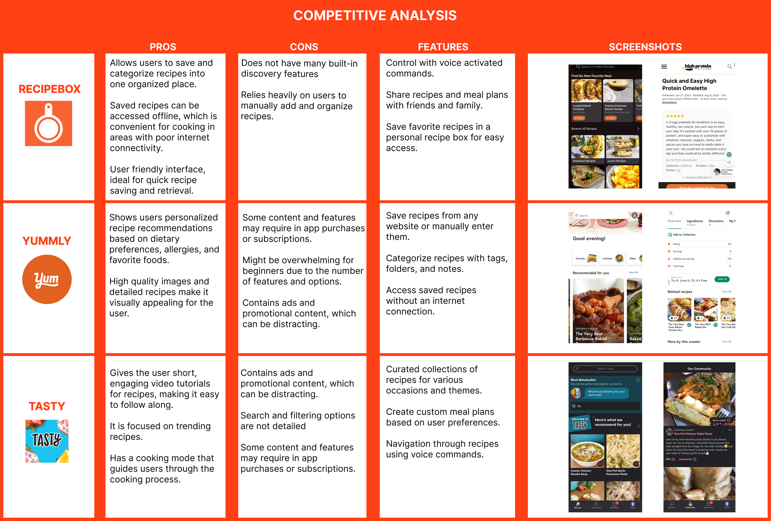
Competitors
For my competitive analysis, I decided to focus on these three apps: Tasty, Yummly and Recipe box. While doing my analysis, I found some issues that were similar between each apps and also individual problems.
UX Challenges
User Diversity
Users may have different dietary restrictions, preferences, and cultural backgrounds, making it challenging to create a universal solution that caters to everyone's needs.
Information Overload
Balancing the amount of information provided in each recipe can be tricky. Too little information may leave users confused, while too much information could overwhelm them.
Recipe Complexity
Some recipes may be more complex than others, requiring intricate steps or specific cooking techniques. Simplifying these without sacrificing quality can be a challenge.
Ingredient Availability
Ingredients for recipes may not be readily available in all regions or during certain seasons. Providing substitutes or alternative ingredient suggestions can help overcome this challenge.
Visual Presentation
Designing an intuitive and visually appealing interface to showcase recipes, ingredients, and cooking steps can be challenging. Finding the right balance between aesthetics and usability is crucial.
USER ANALYSIS
I created an empathy map to document high-level behaviors, goals, frustrations, and influences. I channeled this into a persona – a document to guide solutions.
USER FLOW
I started mapping out the Munch’in experience through flows. I wanted to visualize a seamless movement throughout the app. Entering the app, getting to the home screen to view different recipe categories , saving your favorite recipes , seeing cooking instructions, adding reviews and seeing other user reviews, among others.
ROUGH SKETCHES
At this point I began to sketch the user flow in the form of the app. After I tested out multiple ways to move through the application – login, sign up, viewing different recipes, moving from home to other screens seamlessly, checking recipe steps and more, I decided to settle with the final sketches presented below.
The problem I found in other recipe apps, was how overbearing they were visually for the user, a lot of information is thrown in your face right from the get go. My goal here was to sketch an app with a visually friendly presentation and simple navigation.
UI KIT
After finalizing the sketches, I created a UI Kit for the app which includes Colors, Icons, Buttons, Typography and Components. This helps to keep a consistent design throughout the high fidelity prototype.
WIREFRAMES
After thoroughly making sketches and writing out details it was time I moved on to creating the mid and high fidelity wireframes of the app. Making the process feel as real as possible was the main focus. This includes adding details for both the UI and content.
PROTOTYPING
After completing the journey of different sketch iterations, wireframes and development of different UI elements. I began working on figuring out the prototyping, creating movement and animation for each screen.
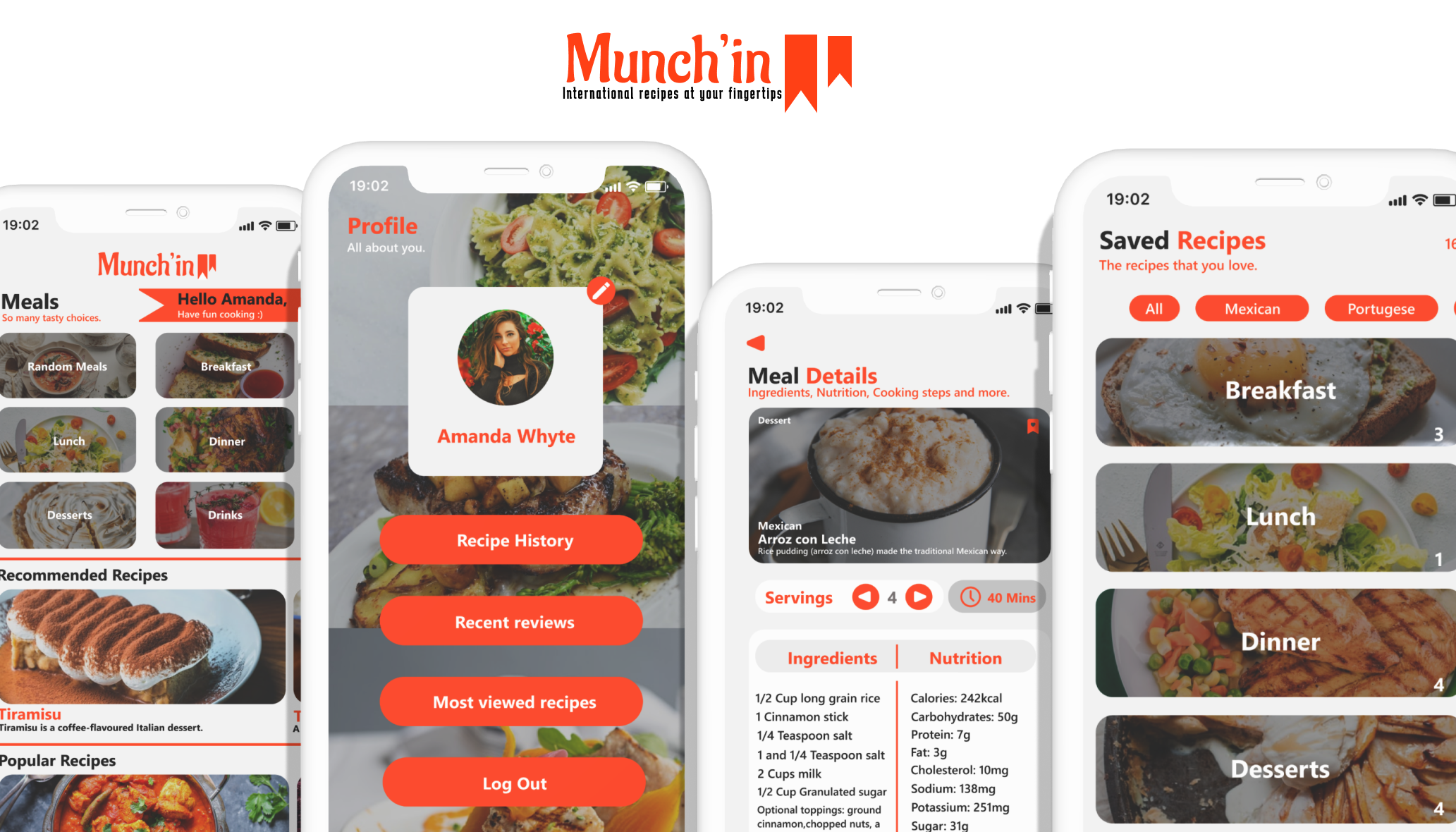
SOLUTIONS
Munch’in clears the clutter and allows users to achieve their recipe and meal preparation goals in seconds while also seeing other users opinions on the many different recipes available to try out.
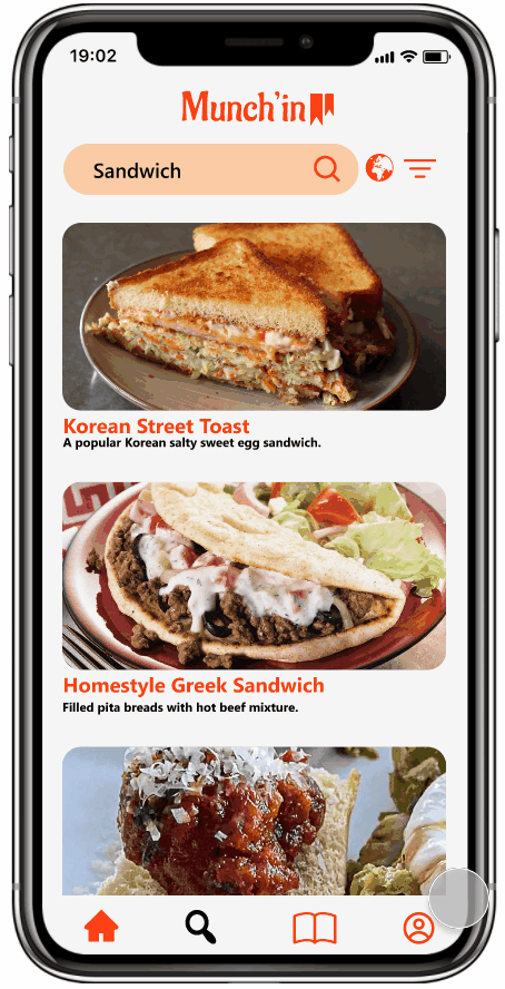
QUICK SEARCH AND FILTER
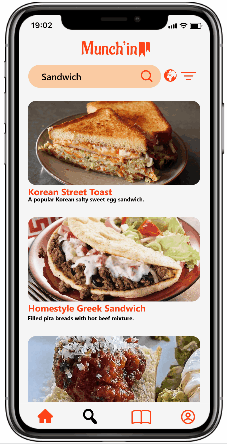
Search for any type of meal you’re itching to eat and filter the results to your specific needs.
EASY TO NAVIGATE UI
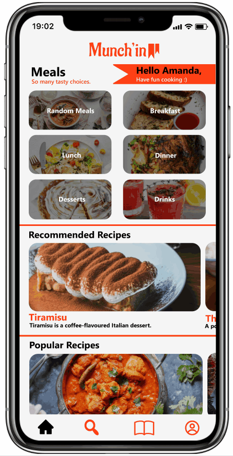
Simple user friendly design, with a visually pleasing presentation. This gives the user an easy free flowing experience when finding recipes.
RECIPE MAP
Discover exciting new recipes from countries you far and wide.
SAVED RECIPES, QUICK INSTRUCTIONS AND RECIPE REVIEWS

Save recipes you like and find cooking instructions in just a few seconds. See other users opinions while saving and cooking.
FIND ALL OF YOUR RECIPE HISTORY
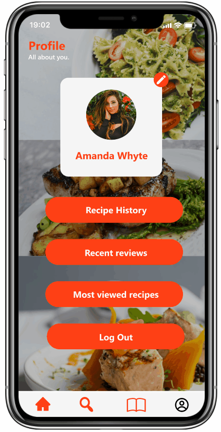
Find your recipe viewing history with ease, just incase you forgot to save a recipe you were interested in.
FINAL SCREENS

WHAT’S NEXT
For future iterations of the Munch’in app, I believe a feature where the user is able to see which stores are closest, with the ingredients they need for the recipes, would be a great addition. I also think that a Dark Mode feature would be good for users that are light sensitive and the ability to enter the app and find recipes without the need to create an account, would be convenient and increase user retention.