Check out all my Graphics Design projects below
Mock TTC Ad
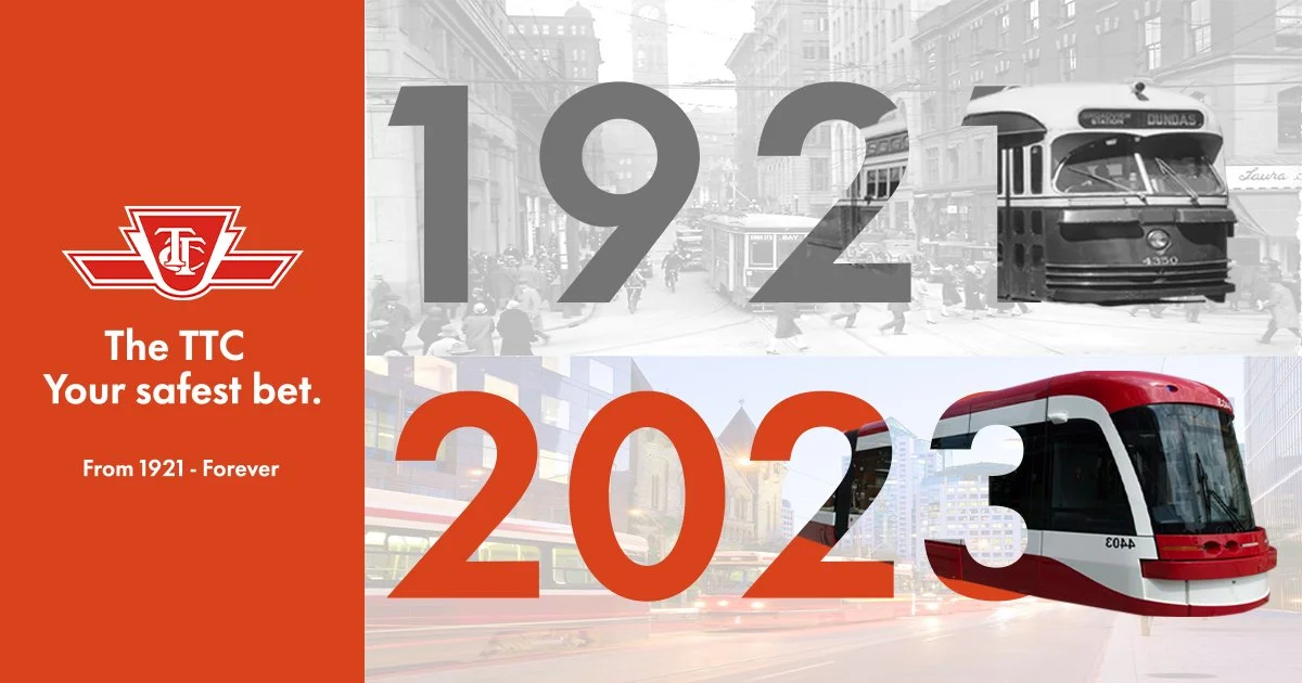
Description
The ad was made to symbolize how the TTC has change over the years, from past to present technological advancements. The top represents the old Toronto from 1921 while the bottom have shows the modern city with a whole new and improved transport system.
Colors
#D7421D
#737373

Typography
Made with

Mock Iphone Ad

Mock motion graphic ad I design for the iphone’s new usb c fast charging feature.
Mock Logo
Mock motion graphic ad I design for a fictional icecream company.
Mock Juice Ad

Mock motion graphic ad I design for a fictional juice making company.

Made with
Mock Company Logo


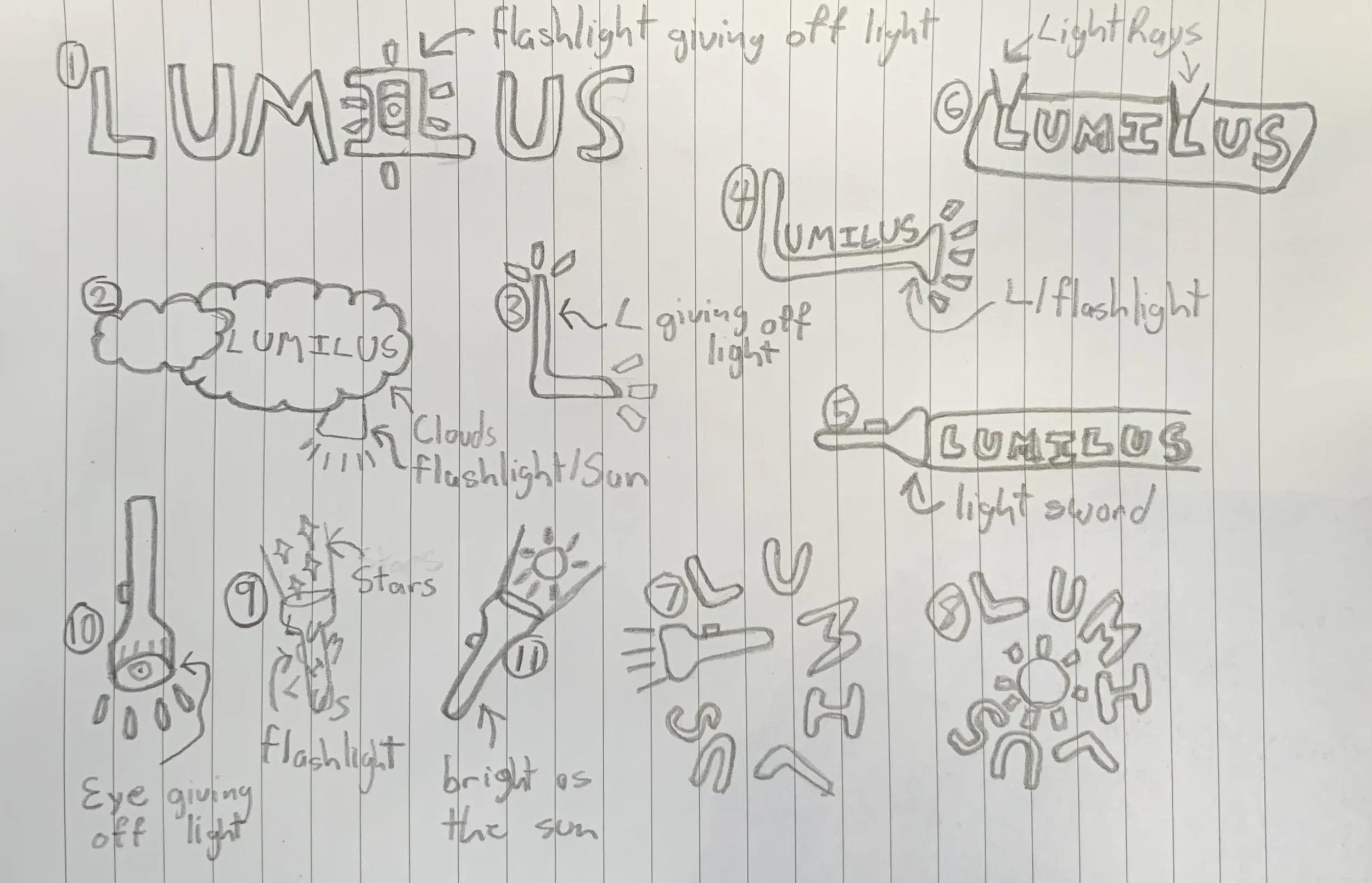
Description
My aim here was to create a lighting company logo that completely represented the aspect of lighting. I created the logo for a company called LUMILUS and created a custom typeface for this logo using tools in illustrator. The color blue was chosen because it presents a feeling of confidence while yellow was chosen for its warmth and the fact the yellow tends to represent light as well as the sun. This can be seen where the letters I and L meet in the logo.
Colors
#FFF100
#00AFF0
Typography
This was a custom typeface that I made in illustrator using the pathfinder and pen tools.

Made with
Mock Soda Can


Description
The goal of this project was to create an eye catching print design for a Soda can. I decided to go with a lighthearted but active look for the design. I chose these specific colors because they complemented the name of the soda while also representing the colors of the fruits being used in the soda. Bright colors are also tend to attract a younger audience. This demographic leans more towards consuming soda. The colors also for bubbles with show this is a carbonated beverage.
Colors
#DA2541
#FBB446
#F37285
#4BB446

Typography
31pt 12pt 9pt

Made with